Brand Identity
web design
Stationary
DINNER AT MINE
Dinner at Mine came to us as a food account with a loyal following and a clear creative energy, but no cohesive identity holding it together. The content was good. The community was there. What was missing was a world for it to live in. The goal was to move beyond food content and shape something that felt like a full lifestyle brand: warm, lived-in, and deeply recognizable without feeling overdesigned or overdone.
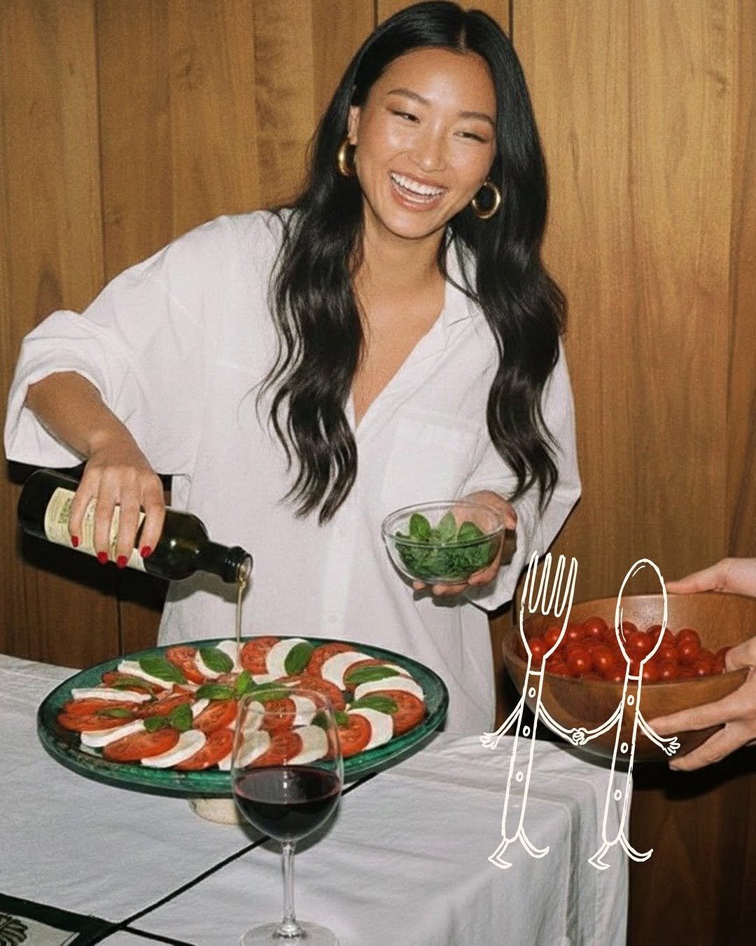
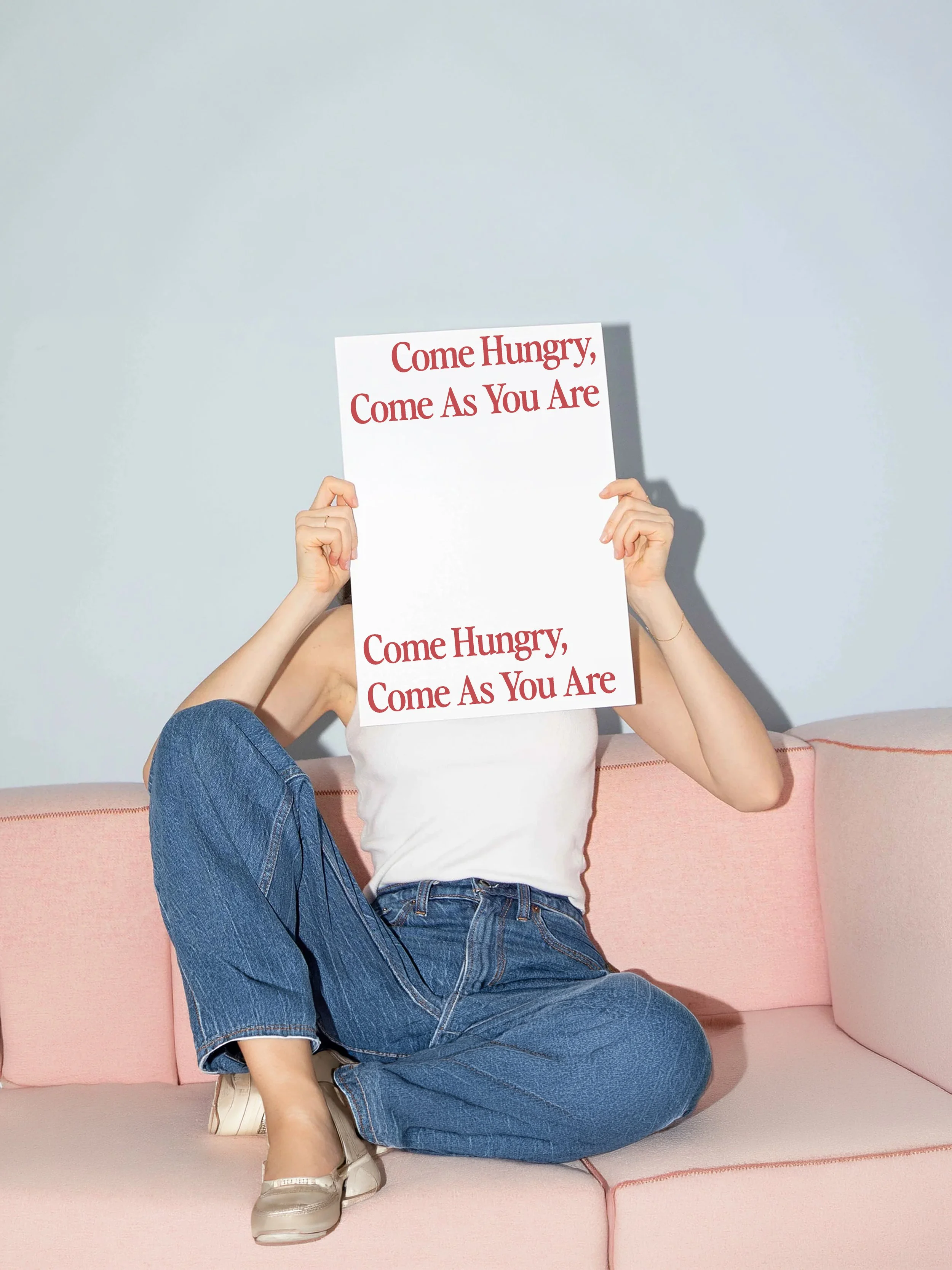
The strategic foundation we built centered on three things: connection, nostalgia, and gathering. Not food as a subject, but food as the reason people come together. That shift in framing changed everything downstream, from how the content was shot to how it was written to what kinds of moments the brand chose to capture.
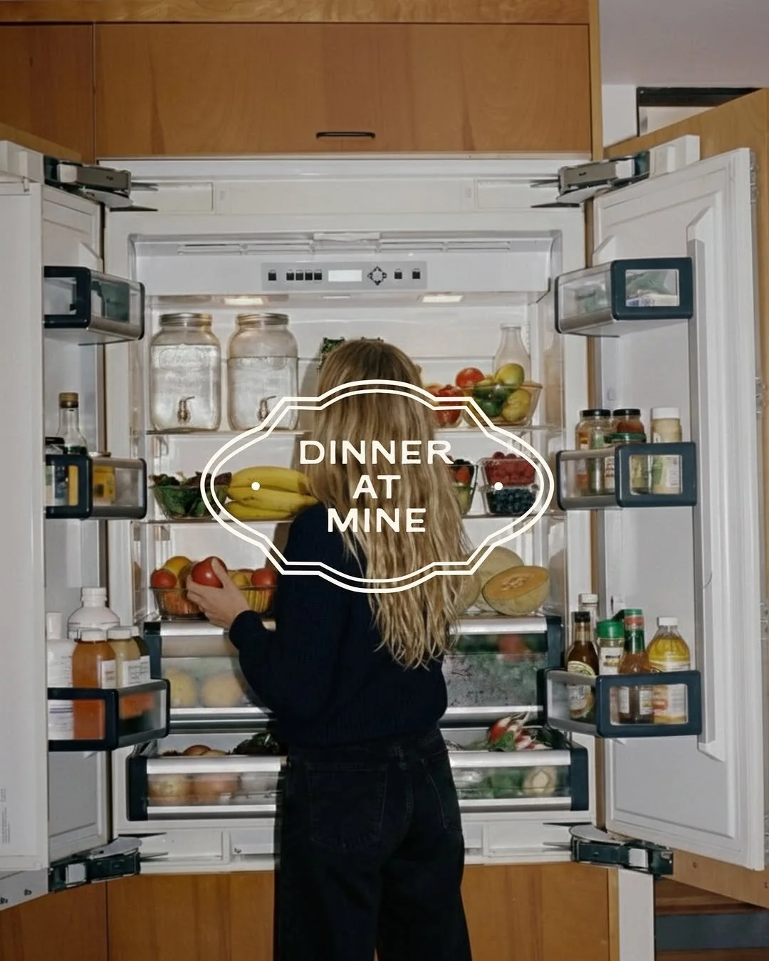
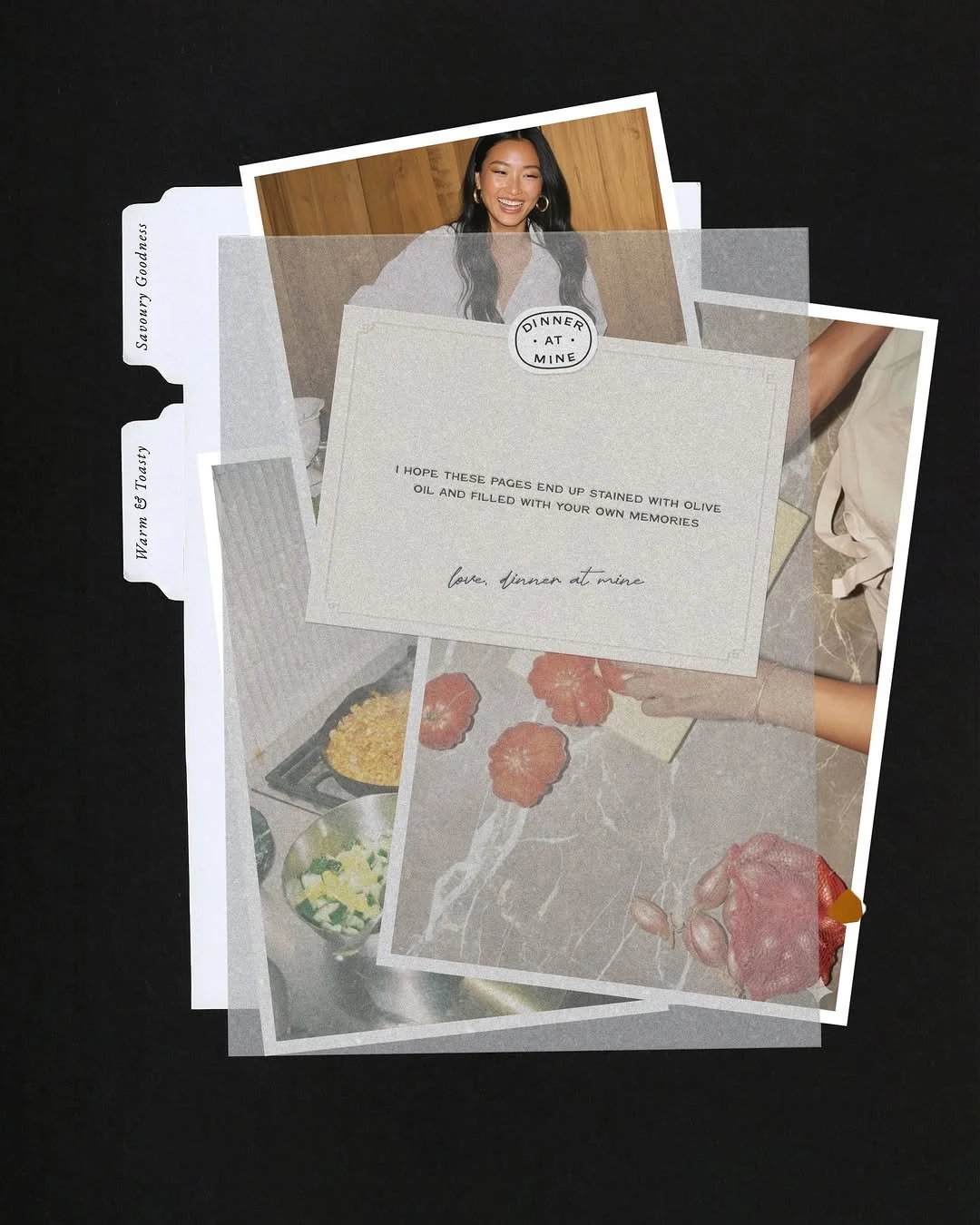
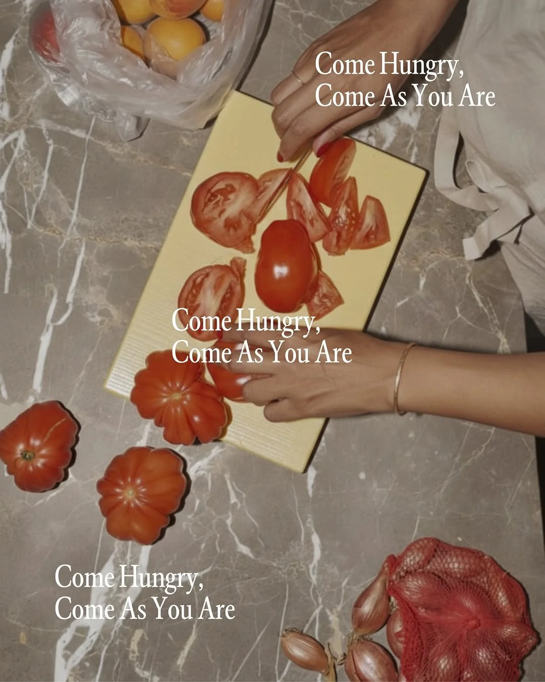
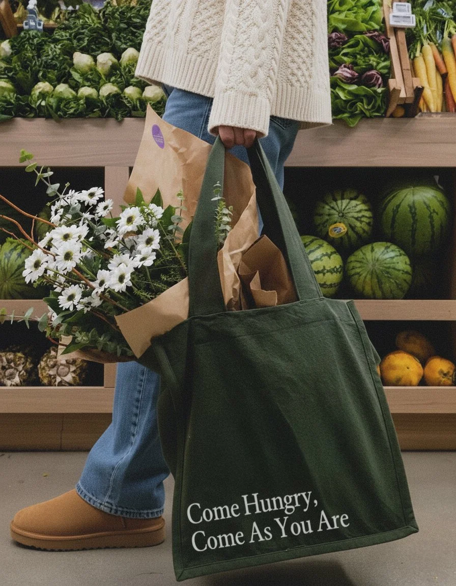
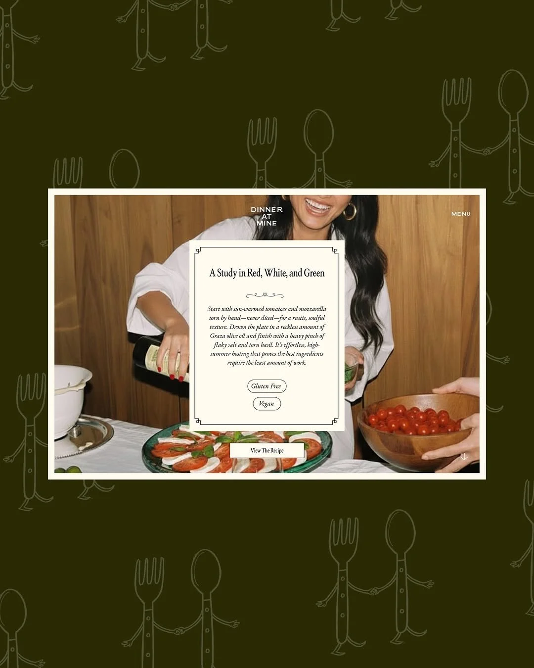
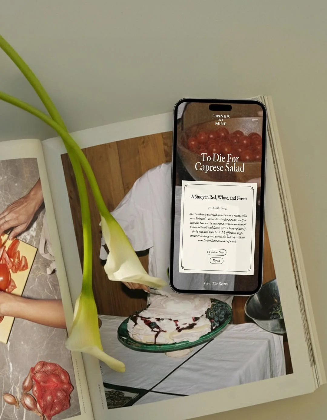
Visually, we replaced clinical studio lighting with a heavy-flash, film-stock aesthetic designed to recreate a specific feeling: 7 PM on a Friday, the first bottle of wine already open, the house full of people you love. The result feels raw, nostalgic, and quietly elevated. Creative direction leaned into deliberate sensory details, manicured nails, dainty gold jewelry, the beautiful mess of an active kitchen, to strike a balance between the wholesome home cook and the aspirational icon. You can be elbow-deep in a recipe and still feel like a muse.
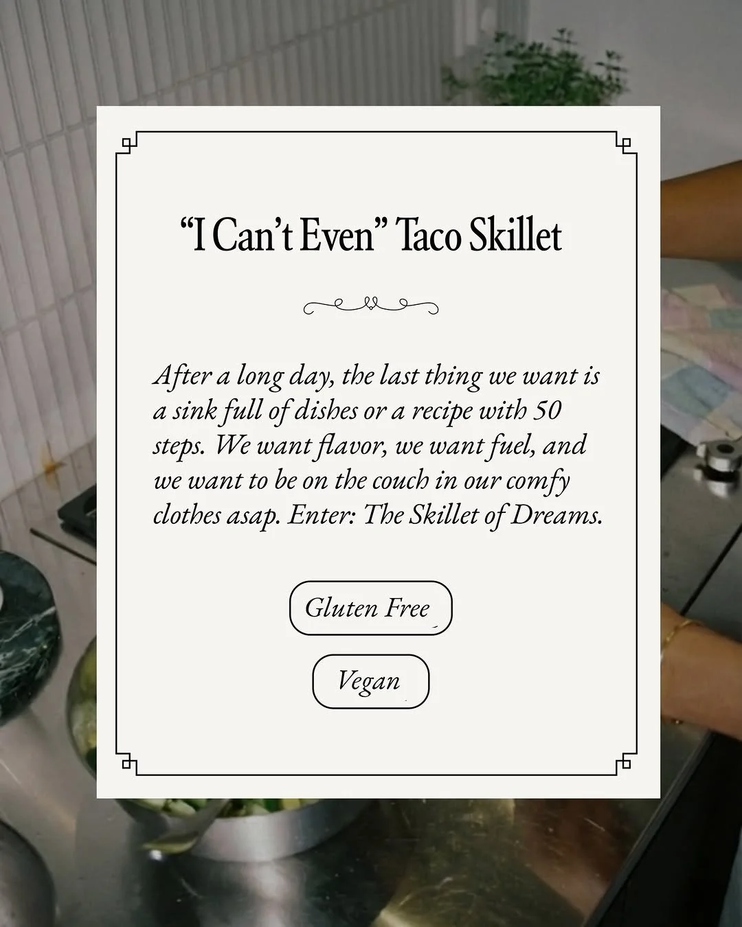
Copy was written to match. Titles like "The I-Can't-Even Taco Skillet" instead of "Step 1: Prep the vegetables." A voice that reads like a voice note from your most fun friend, spunky and soulful, never stiff. The result is a brand that feels lived-in because it is, and elevated because every detail was considered.